Client: Air Moldova
Work: Visual communication + branding for one year
Date: 2019
This project was made @imago.md.
3d mockup implimentation by @i.canonic.
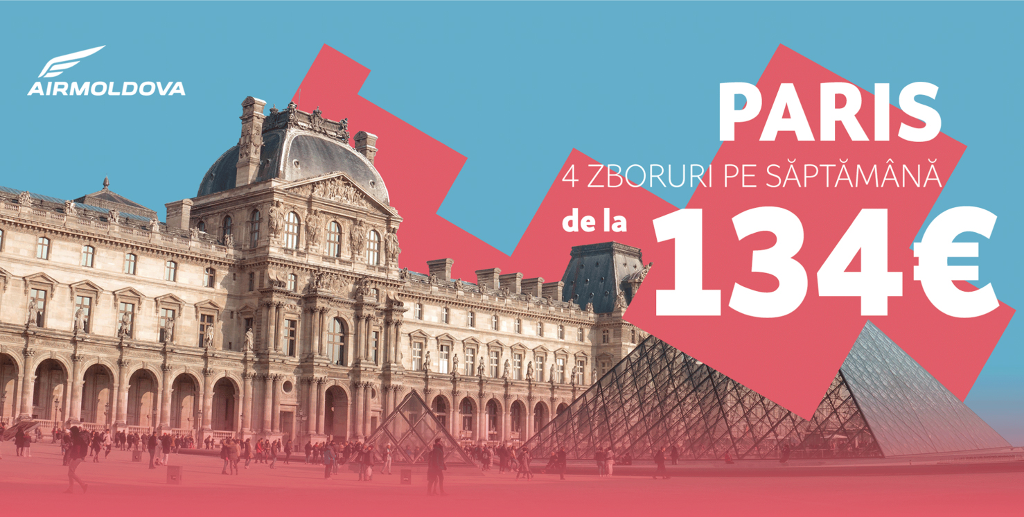
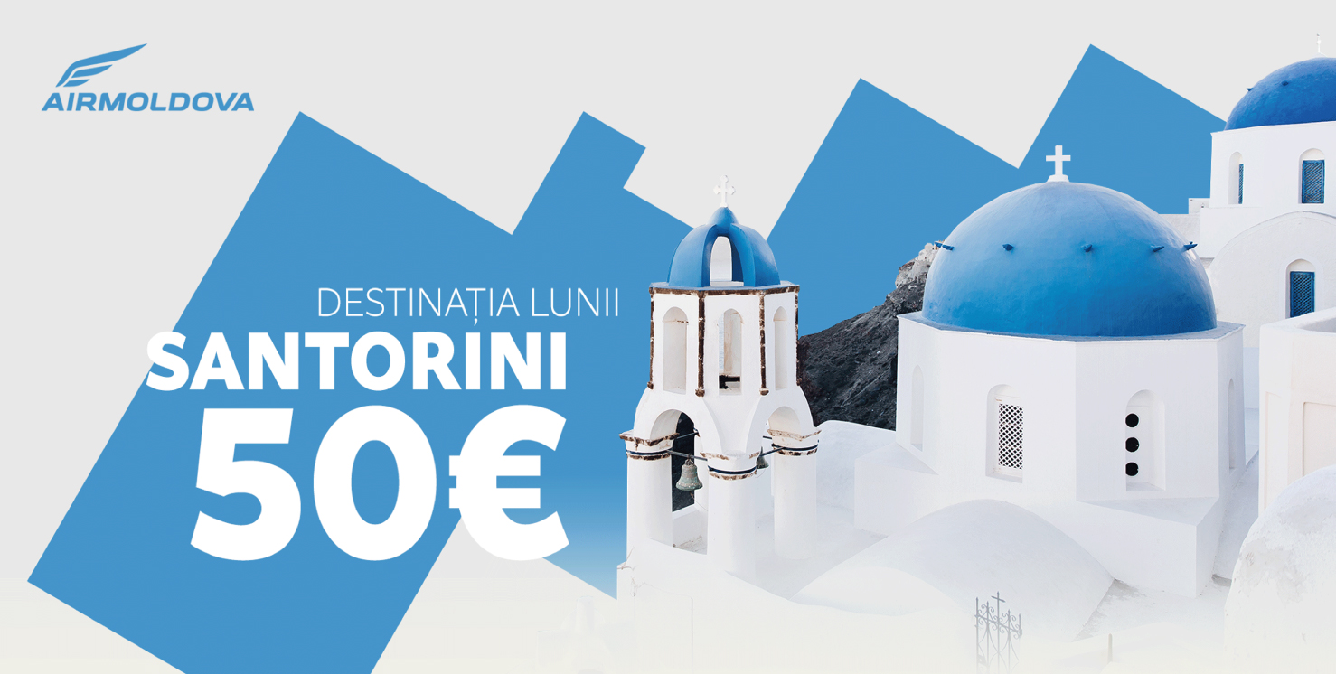
Details: The visual presence of the airlines competitor companies showed us how the design shouldn't look like. To make a difference, we created a pattern based on a simple rectangular shape, rotated at 30 degrees.
The task was to develop a visual communication identity for 2019 – an umbrella for a series of promotional and image campaigns. Moreover, this identity had to be extended to a number of products involved in the flight experience of travelers.
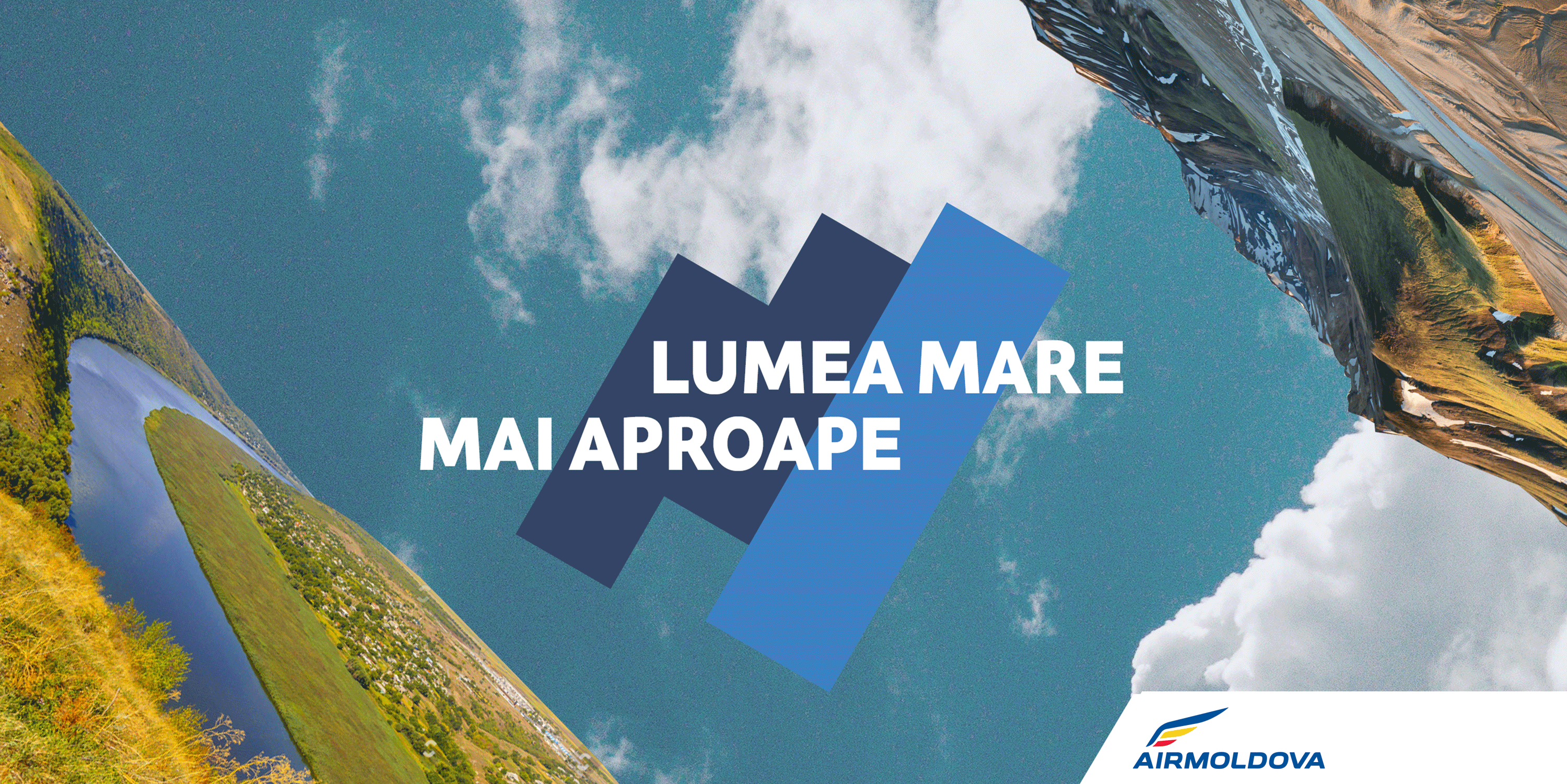
Here came the decision to make the mirroring and flip for 30 degree. To show the connectivity of the destinations that are brought to you by Air Moldova.
Examples in usage for the main campaign, on the left side we have a Moldavian landscape with the river Nistru and on the other side, mountains from other lands.
Branding is good when served in small, systemic portions throughout the entire travel experience. Therefore, the visual identity was also extended to the aircraft. We developed the design of the whole onboard serving food set. We proposed to switch from plastic to biodegradable tableware, or at least recyclable.


