Client: OUEST-EST
Work: Branding & Logo design
Date: 2019 - 2020
This project was made @imago.md.
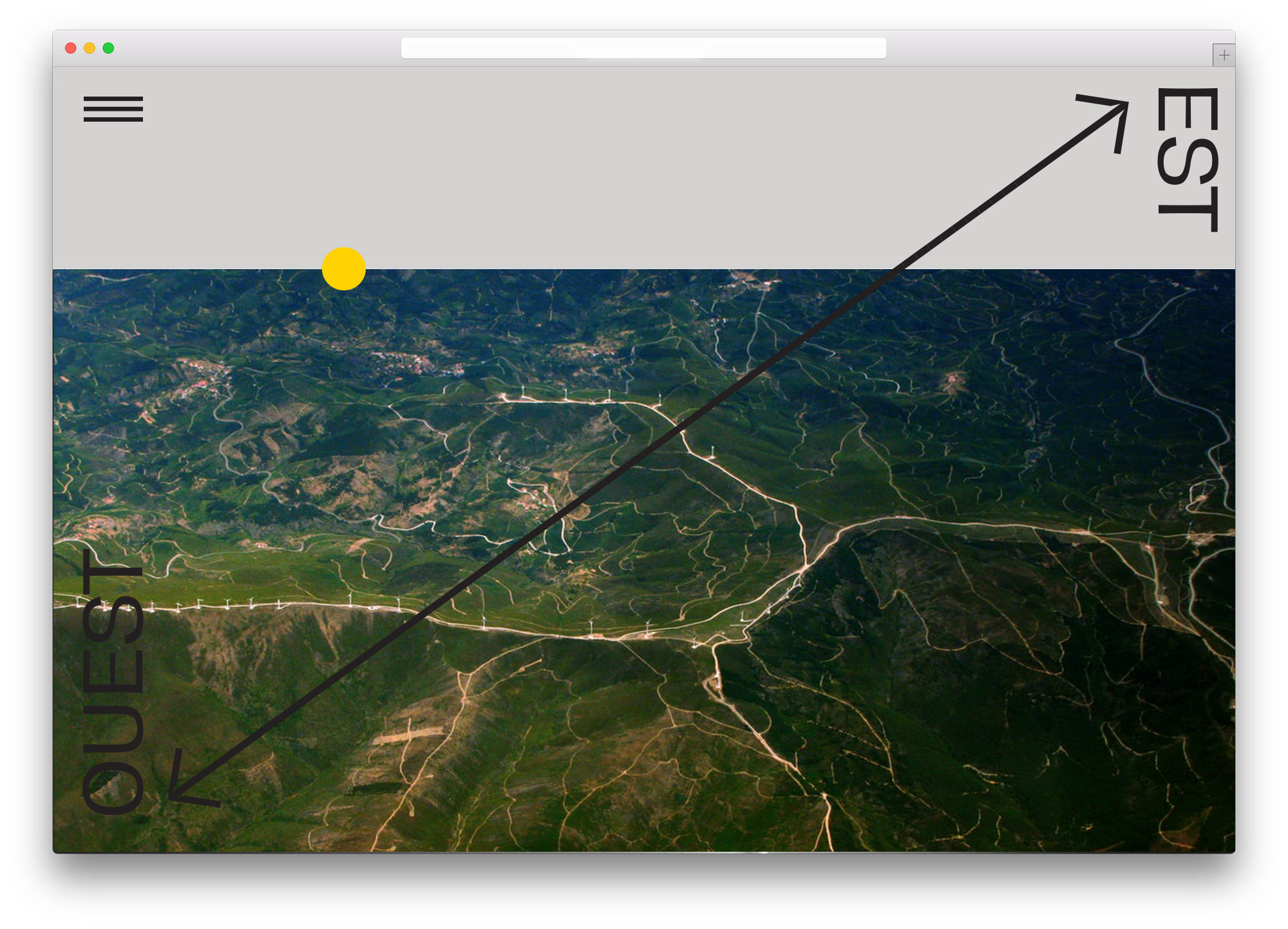
Details: Importance of connection between two sides, bridge of business relationship between France and Moldova. We had to construct that visual bridge between France and Moldova. We decided to visualize the easiest “way” from A to B as a shortcut. For main brand imagery we used aerial photos of ways.
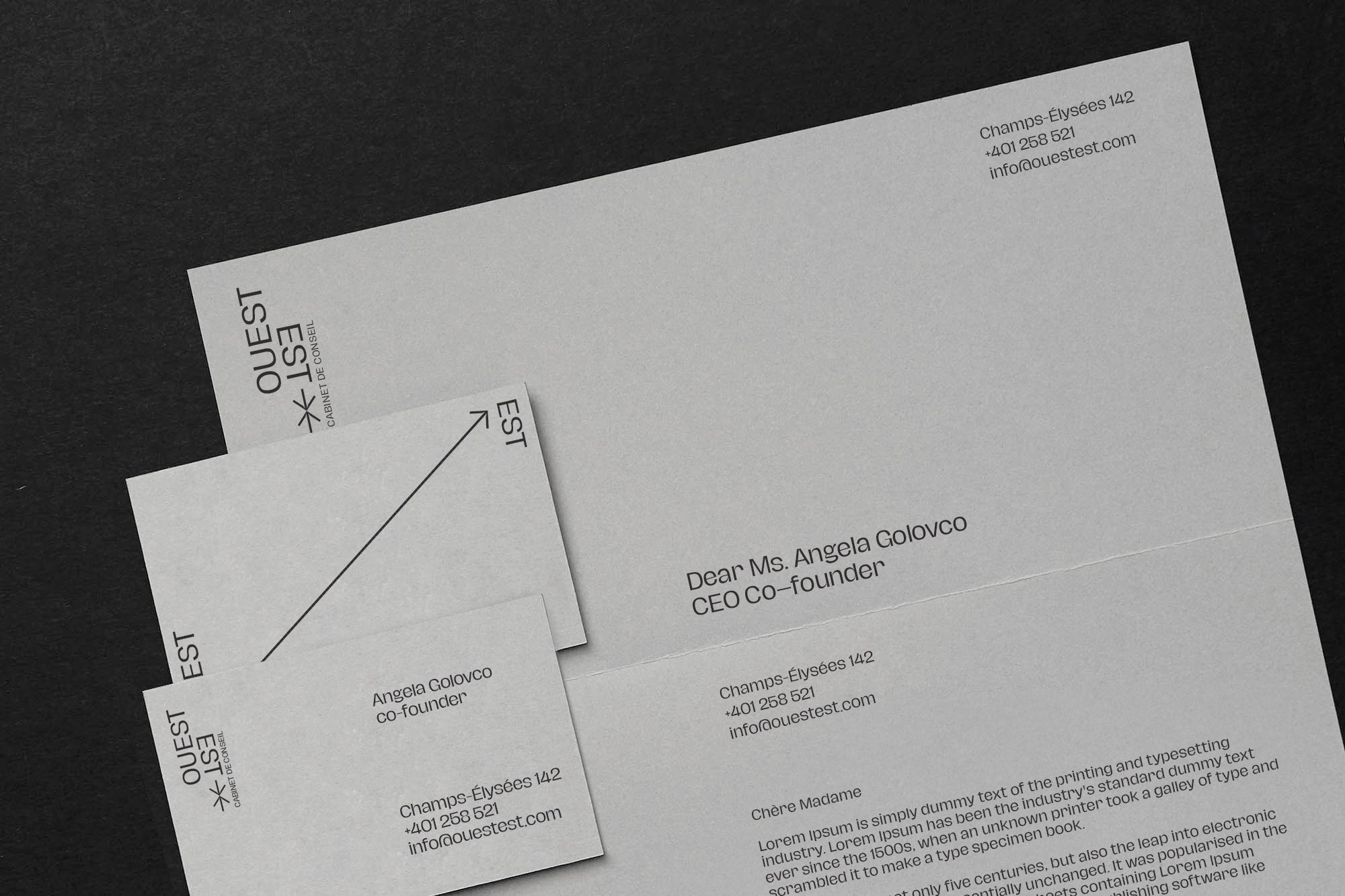
The stationery is clean, giving the transparency of the business work. Brand colors are grey and black trying to imitate documents. Accent color is yellow.
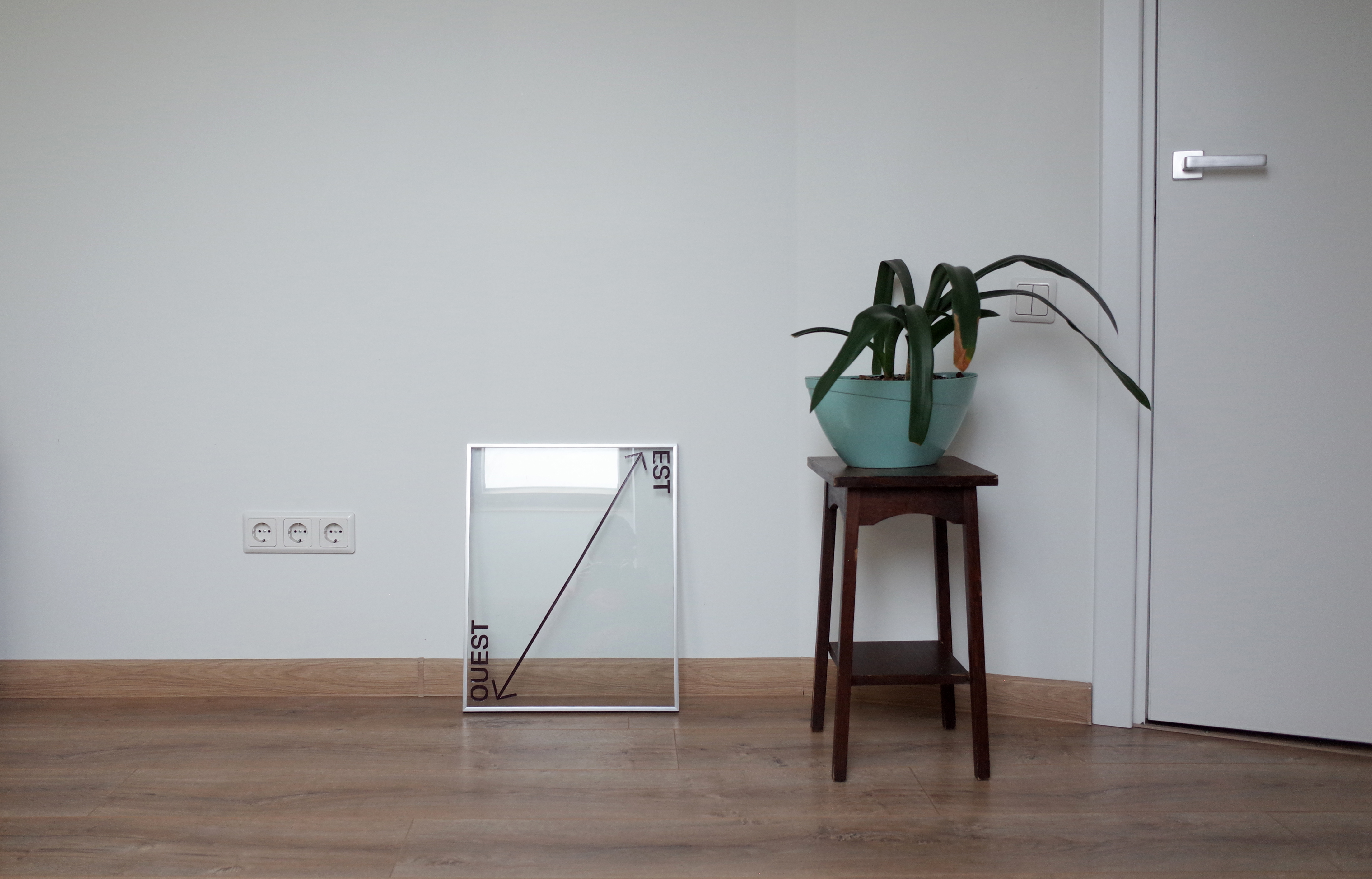
The distinctive brand constructive element is an arrow, the directive procedure. This graphic element can be used to give an accent to typography, to give significance to text as headlines.
Work: Branding & Logo design
Date: 2019 - 2020
This project was made @imago.md.
Details: Importance of connection between two sides, bridge of business relationship between France and Moldova. We had to construct that visual bridge between France and Moldova. We decided to visualize the easiest “way” from A to B as a shortcut. For main brand imagery we used aerial photos of ways.
The stationery is clean, giving the transparency of the business work. Brand colors are grey and black trying to imitate documents. Accent color is yellow.
The distinctive brand constructive element is an arrow, the directive procedure. This graphic element can be used to give an accent to typography, to give significance to text as headlines.