Client: ECLAIR - HOME DECOR SHOP
Work: Rebranding & Logo design
Date: 2019 - 2020
Details: Eclair is a conceptual salon of functional, beautiful and high quality products for home that brings color to people's life. It offers exclusively branded, stylish and quality products from Great Britain, Germany, USA and Holland.
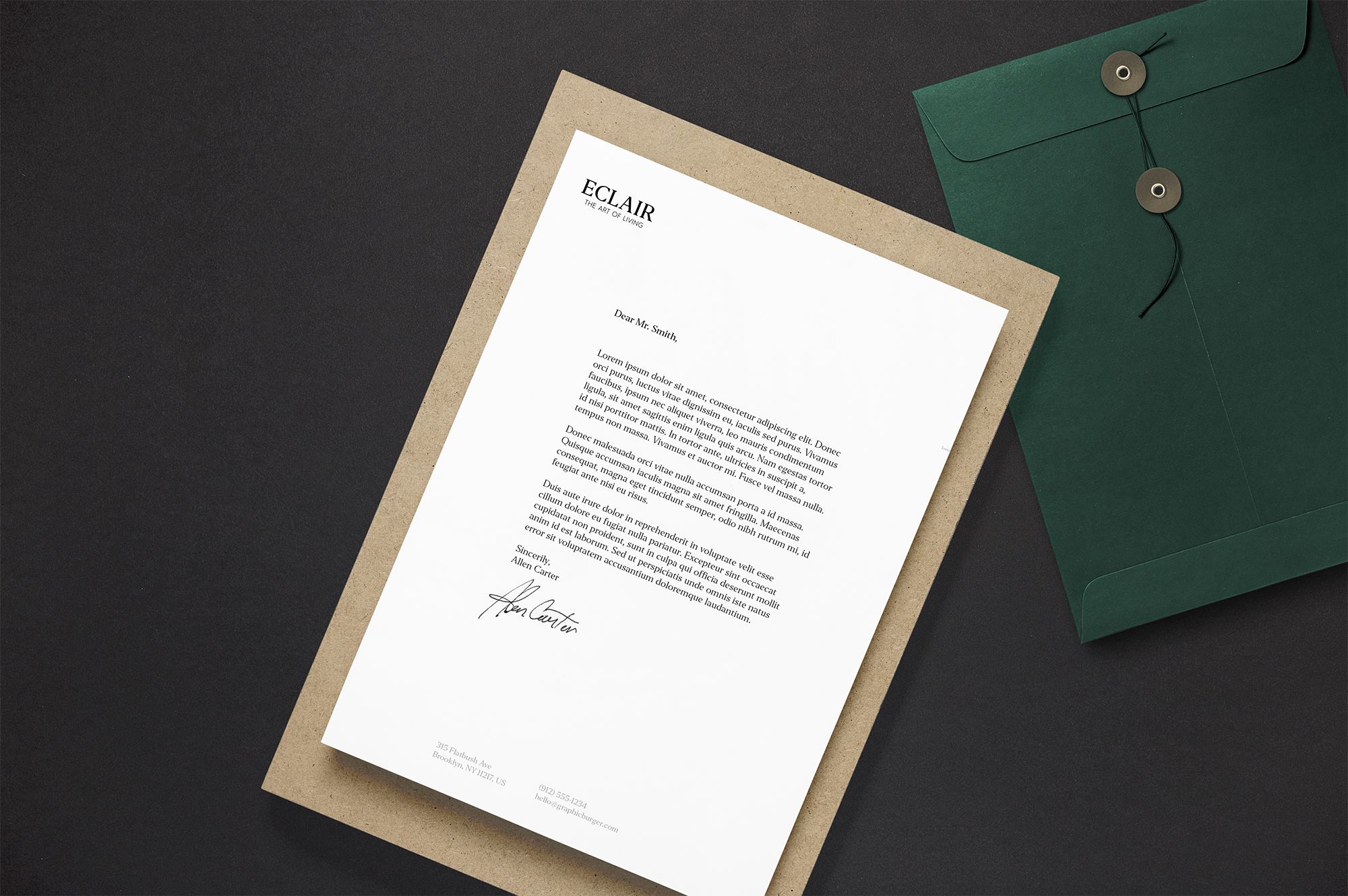
Task was to renovate the old brand identity and to make a whole color grading and packaging, from stationery to custom patterns.
Fonts in usage: Editor family + Montserrat for taglines.
The idea was to represent an established brand with family roots and to make an accent on the “strong - establishment”.
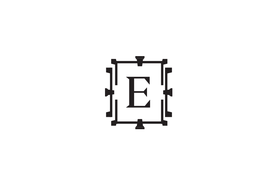
I decided to make a monogram variation for main logotype, to use it when you’ll need just a simple but strong accent. Elements of the monogram was inspired by windows of the shop building, that is a historical monument, reconstructed by the owners.
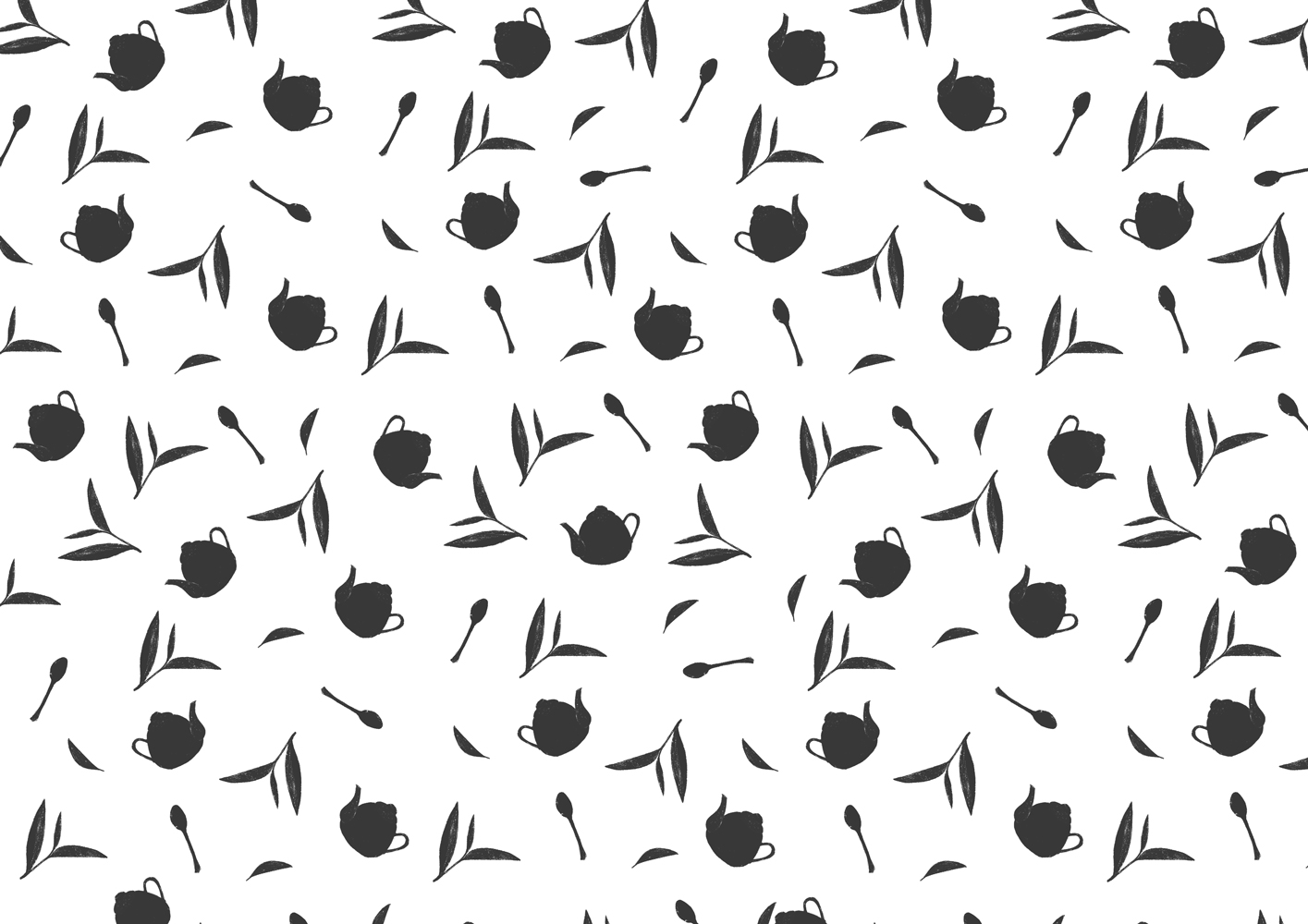
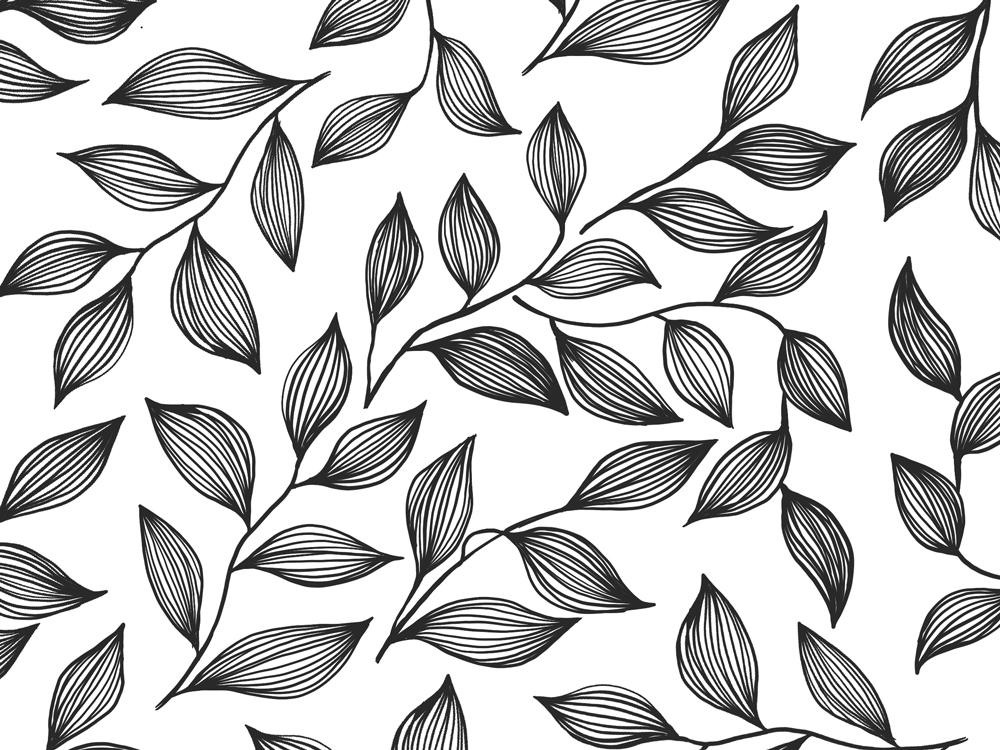
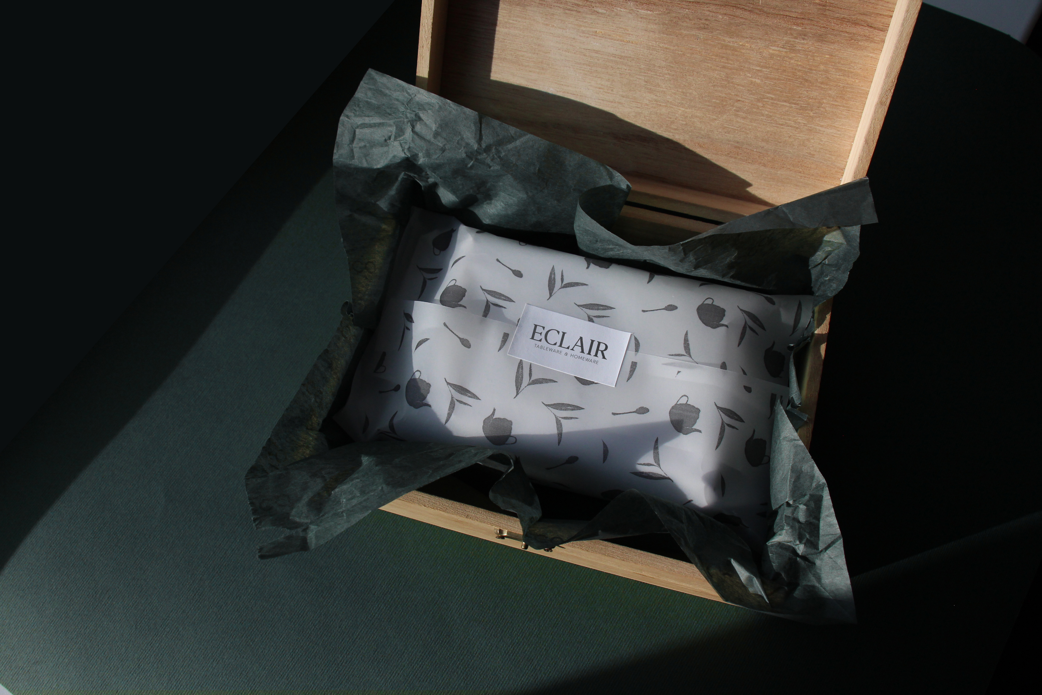
Also, for brand accent we decided to bring patterns that will have future usage in paper warpers of the products or for web banners for background. Patterns are inspired from tea world: accesories for tea-time, stylised tea leafs.
Work: Rebranding & Logo design
Date: 2019 - 2020
Details: Eclair is a conceptual salon of functional, beautiful and high quality products for home that brings color to people's life. It offers exclusively branded, stylish and quality products from Great Britain, Germany, USA and Holland.
Task was to renovate the old brand identity and to make a whole color grading and packaging, from stationery to custom patterns.
Fonts in usage: Editor family + Montserrat for taglines.
The idea was to represent an established brand with family roots and to make an accent on the “strong - establishment”.
I decided to make a monogram variation for main logotype, to use it when you’ll need just a simple but strong accent. Elements of the monogram was inspired by windows of the shop building, that is a historical monument, reconstructed by the owners.
Also, for brand accent we decided to bring patterns that will have future usage in paper warpers of the products or for web banners for background. Patterns are inspired from tea world: accesories for tea-time, stylised tea leafs.